Why is accurate color important? In today’s business landscape, packaging is not just a means to protect products but also a powerful communication tool with consumers. Choosing the right color plays a critical role in building brand recognition, highlighting its uniqueness and values.
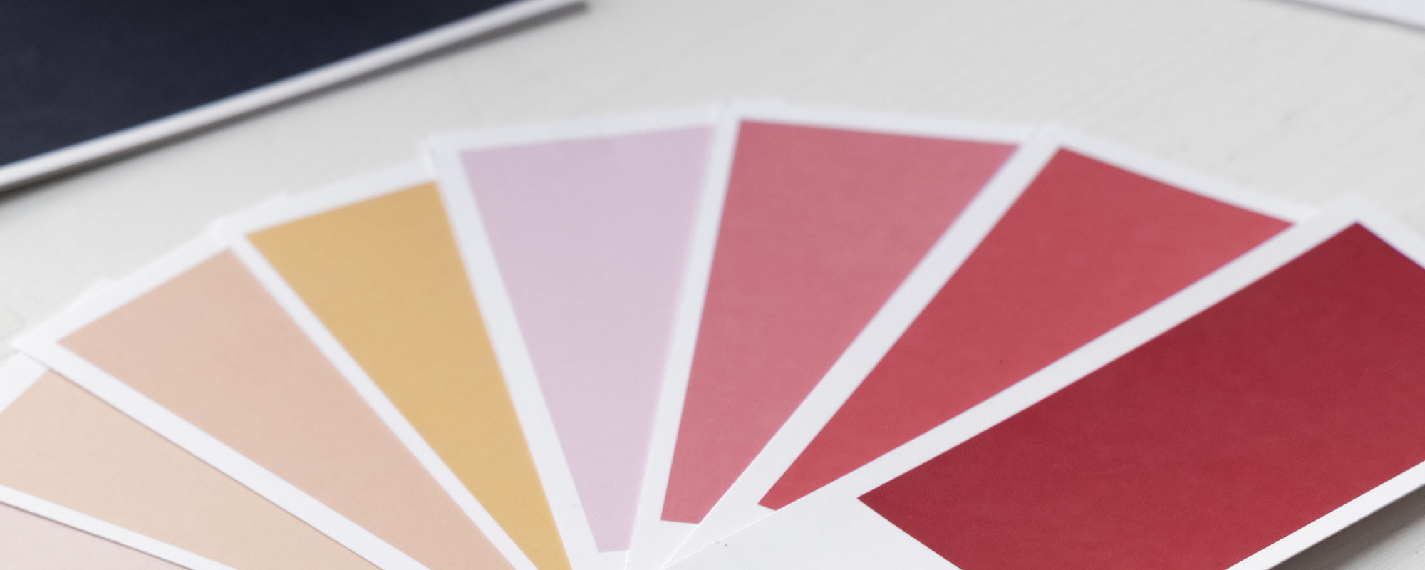
What is Pantone and why does it matter?
Pantone is a universal color system that ensures accuracy and consistency in printing. Using Pantone guarantees that your chosen shade will be reproduced with maximum precision, regardless of print runs or materials used.
-
Universal Standard: Pantone is recognized worldwide, eliminating misinterpretation of colors.
-
Color Stability: Even complex shades remain consistent during reprints.
Why check colors against the Pantone palette?
-
Avoid Discrepancies
Monitor screens or printed samples can distort shades. Using the original Pantone palette helps agree on exact colors, minimizing mismatches. -
Consider Material Specifics
Colors can appear differently on various materials (cardboard, paper, plastic). Checking colors with Pantone ensures these nuances are accounted for. -
Trust and Professionalism
Accurate reproduction of brand colors reinforces trust in your brand and demonstrates a professional attention to detail.
How Do We Work with Pantone?
-
Our specialists always cross-check selected colors with the original Pantone palette during the design process.
-
We offer the option to pre-approve colors, ensuring your confidence in the final result.
-
We utilize advanced equipment to accurately reproduce Pantone shades on various materials.
Create packaging that vividly and accurately reflects your brand!
Contact us to discuss your project and receive expert advice on color selection and materials. With our help, your packaging will be both sustainable and visually flawless.